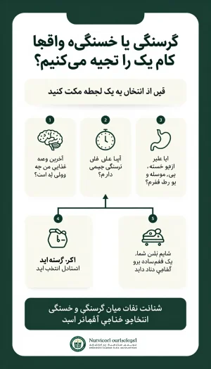
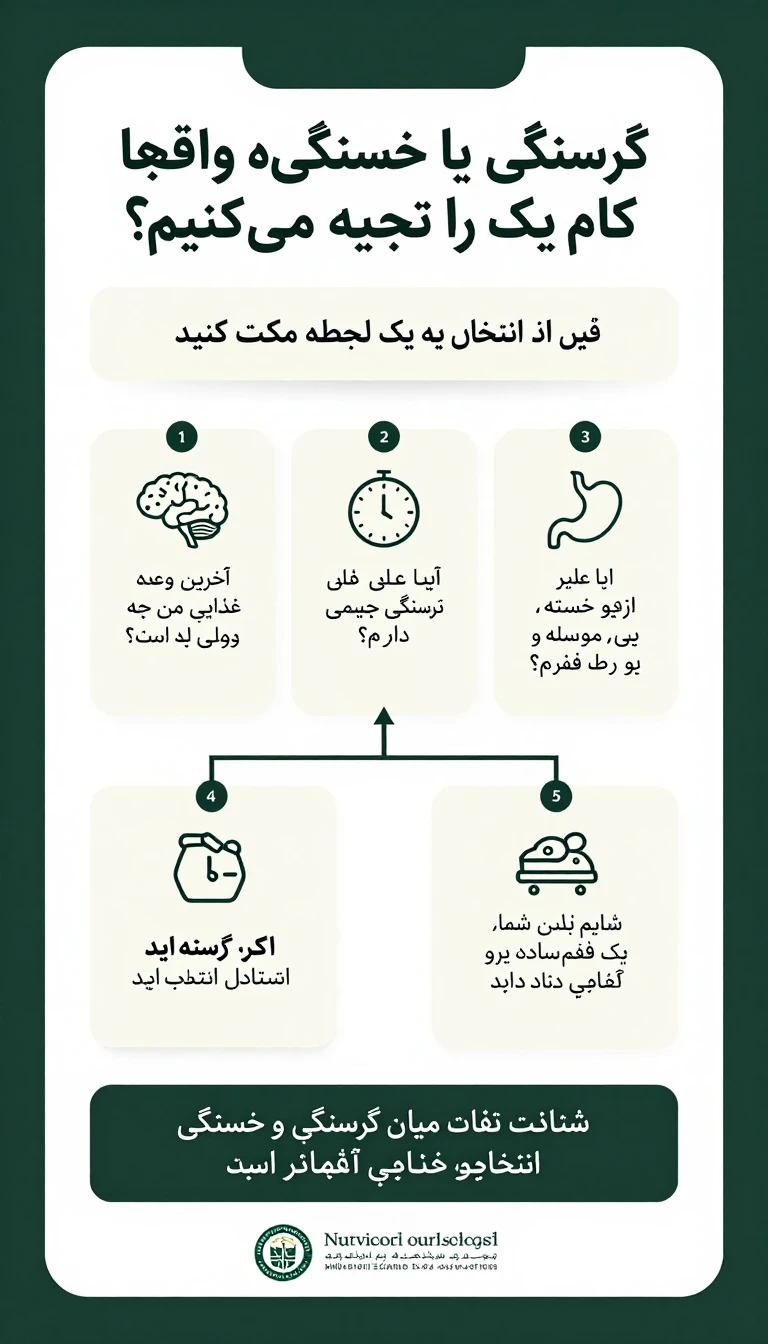

Create a professional vertical poster for a university Nutrition Sciences Association, designed specifically for Telegram and optimized for mobile viewing. Topic: “Hungry or Just Tired? Which One Are You Really Experiencing?” Design style: - Modern, minimal, clean, academic, and scientifically credible - Elegant university-oriented visual identity - Strong visual hierarchy - Plenty of negative space - High readability on smartphone screens - Step-by-step storytelling layout - Use a modern Persian font similar to Vazirmatn or IRANSans - All Persian text must be perfectly readable, right-to-left, correctly aligned, and properly typeset - Avoid excessive decoration or visual clutter - No photographs of people - Use simple, elegant icons related to the brain, clock, stomach, sleep, and healthy snacks - Use a refined color palette based on dark green, cream, and white - High contrast and polished typography - Leave a clean, organized area at the bottom for the university Nutrition Sciences Association logo and name - Do not create or invent a logo Poster structure: 1. Main title: “گرسنگی یا خستگی؛ واقعاً کدامیک را تجربه میکنیم؟” 2. Opening question: “ناگهان هوس شیرینی، چیپس یا نوشیدنی شیرین میکنید؟” 3. Transition: “قبل از انتخاب، یک لحظه مکث کنید.” 4. Introduce three questions as three separate elegant cards: “آخرین وعده غذایی من چه زمانی بوده است؟” “آیا علائم گرسنگی جسمی دارم؟” “یا فقط خسته، بیحوصله یا تحت فشارم؟” 5. Decision section with two clear visual branches: “اگر واقعاً گرسنهاید” → “یک میانوعده متعادل انتخاب کنید.” “اگر بیشتر خستهاید” → “شاید بدن شما به استراحت و خواب کافی نیاز دارد.” 6. Final highlighted statement: “شناخت تفاوت میان گرسنگی و خستگی، یک قدم ساده برای انتخابهای غذایی آگاهانهتر است.” 7. Footer: “انجمن علوم تغذیه دانشگاه” Visual direction: The viewer should naturally move from the title to the question, then through the three questions, and finally to the two possible outcomes. Use subtle arrows, numbered steps, spacing, and visual grouping to make the reading flow obvious without requiring large amounts of text. The overall result should feel like a high-quality university health-awareness infographic, not an advertisement and not a generic social-media template.
More from hadi najafpour
Explore more work from this creator.