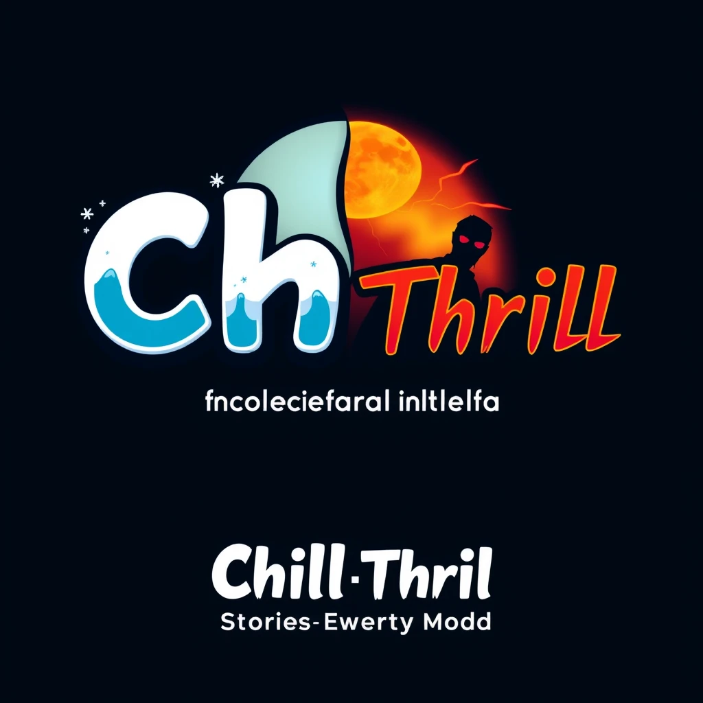

Use a mix of bold and playful fonts for "Chill" and "Thrill" to represent the contrast between lighthearted and suspenseful themes. "Chill" could be in a soft, rounded, cool font, perhaps with ice or frost accents to give a relaxed vibe. "Thrill" could be in a sharp, edgy, or angular font, maybe with subtle shadows or a glow effect to reflect excitement or suspense. Color Scheme: "Chill": Use cool colors like light blue, teal, or icy white to give off a calm, relaxing feeling. "Thrill": Use bold, contrasting colors like red, neon yellow, or electric green to give an intense, thrilling feel. The background could be a gradient blend from cool blues/whites (for Chill) to fiery oranges/red (for Thrill). Visual Elements: For Chill: Incorporate snowflakes, ice crystals, or a smooth wave-like design. For Thrill: Add a subtle shadow of a scary or mysterious figure, maybe a silhouette of a ghost, a lightning bolt, or a full moon. Both elements should connect subtly, maybe by intertwining these effects—like frost creeping into the "Thrill" part of the design or a shadow in the "Chill" part. Motivational Touch: Under the main title, you could add a simple tagline like "Stories for Every Mood" or "Laugh, Shiver, and Rise" in a smaller font to represent the motivational side. Icon: Create a small, simple storybook or film reel icon beside the text, hinting at the storytelling element. Alternatively, a split design could work where one side is a calm, moonlit night (Chill) and the other side has a stormy sky with a lightning bolt (Thrill). Logo Layout Example: Top Line: "Chill" (in icy, cool font) / "Thrill" (in edgy, bold font) Underneath (Tagline): "Stories for Every Mood" (smaller, soft font) Side Icon: A half-open book or film reel on the left side of the name
More from Clarie Anderson
Explore more work from this creator.